The importance of good visualization representation is increasing as data is becoming more complex and larger in quality. To get the real benefit of big data and to use it in the decision-making process, humans need an easy way to understand data and perform fast and rational decisions.
Visualization helps to organize and present big data in an easy-to-perceive way, especially in cases where problems are complex and it is difficult for humans to analyse the data and understand its meaning. Visualization is a way to help humans make sense of the data. If it makes sense to the audience, they can communicate it to relevant stakeholders.
Using a visualization is the first step and providing interactions to see more insights into data is the next step towards the understanding of big data. Interactions allow users to filter and drill-down the information to deeper levels and analyse the underlying story.
Simple visualizations like bar, line and pie charts do not provide enough features to handle big data in a single representation. Advanced visualization techniques are required to best present big data to the audience.
Challenges with Big Data Visualizations
Since the main purpose of big data visualizations is to provide a visual way to understand complex data, there are certain challenges designers face while trying to keep the visuals simple. A few main challenges are mentioned below, and since data and design need to be integrated together to provide an enhanced user experience, we can see how UX design principles can help to overcome these challenges.
Common design challenges:
-
Understanding the problem that you want to resolve with visualization.
-
Selecting the appropriate visualization to present the required information.
-
Providing meaningful interactions to give more insights into the presented data.
How Does UX Design Help in Visualizing Big Data?
By applying UX principles, you can achieve the real purpose of big data visualization by simplifying the presented information.
Understand your users
To provide a design solution to any problem, it is important to understand the users who are going to use that solution. Like any other design task, big data designing also requires the involvement of users from the beginning of the process.
The UX designer performs user research and identifies the users who will use the designed visualizations for better decision-making. Observing the users and their behaviours helps you decide what interactions you need to provide, and when to provide them. Check their level of expertise and understanding of advanced visualizations. This will help you to define the complexity of the proposed solution.
Define the problem
It is important to define the problem that you want to resolve using big data visualization. Try to find the purpose of the visualization and identify what the user wants to see and analyse to make better decisions. How to process data and present it in visualization totally depends on how your users will use it to achieve their goals.
Select appropriate visualization type
Selecting a visualization type that fulfills the requirement of visualization is a key step in designing big data. The main purpose of a visualization is to provide an easier way for the human brain to understand and analyse patterns, trends, and outliers in big data. If you select a visualization type that is not making it easier to define the relationship of data, then the visualization is not useful.
It is essential for UX designers to continuously grow their knowledge about the wide range of available visualization approaches. Each visualization has its own purpose and usage guidelines and should be selected based on the available data and user expectations.
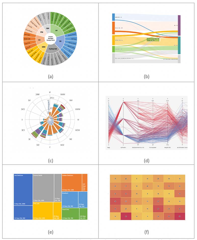
A few common visualizations are shown below:

Common Visualization Types: (a) Sunburst Chart (b) Sankey Diagram (c) Polar Coordinates Chart (d) Parallel Coordinates Chart (e)Treemap (f) Heatmap
The UX designers need to select a visualization type carefully by considering the following factors:
Design of Visualization
This includes the layout of the visualization like if you need to select a graph that is based on polar coordinates or a cartesian coordinates system. The layout of a visualization directly impacts its usability.
Data Requirements
Select a visualization that suits your data representation requirements like if you want to represent hierarchical data based on one attribute or if you want to compare multi-attribute data where each attribute is analysed and compared with others. Selecting a type that does not match the available data will affect the user understanding.
Ability to Get Better Insights
A visualization performs better if users can easily capture data, compare it, and analyse it based on the comparison. Choose a type that makes it convenient for users to get the underlying story behind the visualization. The graph or chart being used should help the user gain insights by looking at the overall data.
Users Capability
Selecting a visualization type to present big data depends on the type of target users and their level of understanding and interacting with data. If you are targeting a group of experienced users, they will find it easier to understand and interact with advanced visualizations.
Identify interactions and resolve them
To get better insights into the given data, the user wants to interact with the visualization. Interaction makes it easier to manipulate data and analyse it deeply. Users can filter and navigate the data and get a better understanding of the relationship between data elements.
It is important to present interactions that are necessary and engaging for the user. Users should be able to identify the next steps while interacting with the data. The process of providing meaningful interaction varies depending on the level of expertise of the target audience.
Display necessary information only
Decide on the key metrics that the user wants to see and will use in the decision-making process. Do not clutter the view by providing information which is not important to the user. Highlight the valuable information by giving it a prominent space on the visualization. Display information in a logical order so that the user can easily interact and analyse the data.
Since dealing with data is a bit tricky, and you may not want to eliminate anything; however, identify the data which has less impact on the decisions and consider removing it.
Summary of Big Data Visualization
It is hard to visualize data when it becomes complex. These given UX design practices will help you to improve the experience of big data visualization for your users. The key take-aways while designing big data solution are:
- Understand your users and identify the problem they want to resolve using big data.
- Provide innovative visualizations and meaningful interactions to improve your big data design solutions.
- Keep in mind the real purpose – the user should be able to get the underlying story behind data, identify the important content, interact and filter, and make informed decisions based on the data.


